Category Archives: photography

Bibliography

Internet

Anon, 2015. Hannah Hoch- Whitechapel Gallery. Last Accessed: 08/04/15. http://www.whitechapelgallery.org/about/press/hannah-hoch/

Artsy, 2015. Hannah Hoch- Collages & other Artwork on Artsy. Last Accessed: 08/04/15. https://www.artsy.net/artist/hannah-hoch

ArtConnect Berlin, 2013. Spotlight on Patrick Bremer – Blog | ARTCONNECT BERLIN. Last Accessed: 13/04/15. http://blog.artconnectberlin.com/2013/12/18/spotlight-on-patrick-bremer/

Patrick Bremer, 2015. PATRICK BREMMER | College Artist. Last Accessed: 13/04/15. http://www.patrickbremer.co.uk/#

Artistaday, 2007-2014. Patrick Bremer-Berlin, Germany Artist- Collage Artists- Painters- Artistaday.com. Last Accessed: 13/04/15. http://artistaday.com/?p=9772

Books

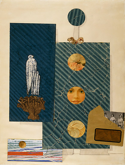
Gunda L. Hoch H. 2010. Hannah Hoch- Picture Book. The Green Box Kunstedition.

Dawn A, Daniel F. H. 2014. Hannah Hoch Hardcover-Illustrated. Prestel.

Richard B, Caroline R. 2014. Cut & Paste: 21st Century Collage. Laurence King.

Linda Hill. 2002. I Dream Before I Sleep (Idee Series), Idee Llc; 1 edition.

Hannah Hoch, 2011. Cutting Edges: Contemporary Collage. Die Gestalten Verlag.

Silke Krohn. 2013. The Age of Collage: Contemporary Collage in Modern Art. Die Gestalten Verlag.

Matthew Biro. 2009. The Dada Cyborg: Visions of the New Human in Weimar Berlin. University of Minnesota Press.

Ruth Hemus. 2009. Dada’s Women. Yale University Press.

Frederick Sommer, Keith F. Davis, Michael Torosian, April M. Watson. 2005. The Art of Frederick Sommer: Photography, Drawing and Collage. Yale University Press.

Holly Harrison. 2007. Mixed-media Collage: An Exploration of Contemporary Artists, Methods, and Materials. Rockport Publishers Inc.

Journals

(Interview) The Weird Show- A Concern on Collage And Beyond, 2013. INTERVIEW: ASHKAN HONARVAR. Max-o-maticonApril 9, 2013. Last Accessed: 14/04/15. http://theweirdshow.info/interview-ashkan-honarvar/

(Interview) The Lovely Daze, 2011. INTERVIEW WITH ARTIST ASHKAN HONARVAR. December 9, 2011. Last Accessed: 14/04/15. http://www.thelovelydaze.com/interviews/interview-with-artist-ashkan-honarvar/

Spring 2005. Aperture 178. Re inventing the spaces within images. Pages 20-25.

Fall 2002. Aperture 168. Contexts, conflicts and congeries. Page 63.

Fall 2006. Aperture 184. Discovery of Brazil collage 1994. Pages 68.

Summer 2007. Aperture 187. Lyle Rexer. Grete in dreamland. The Photomontage of Grete Stern. Pages 60-67.

Winter 2007. Aperture 189. Lyle Rexer. Modernist photography in central Europe. Pages 34-39.

Winter 2008. Aperture 193. David Levi Strauss. On the Edge of clear meaning. Pages 66-73.

Spring 2009. Aperture 194. Jessica Helfand. Look Close. The Scrapbook. Pages 56-61.

Summer 2009. Aperture 195. Jason Evans. The artist formerly known as fashion photographer. Pages 48-56.

Winter 2010. Aperture 201. Magdalene Keaney. Fastnacht. Pages 60-63.

Spring 2011. Aperture 202. Vince Aletti. Both sides now. Pages 66-73.


Exhibitions

2014-2015. In Black and White: Prints from Africa and the Diaspora. Victoria and Albert Museum. London. Sat 29 November 2014 – Mon 6 July 2015.

Jill Evans. 2015. Right Here: The City as Muse. Solent Showcase. Southampton. 27 March – 9 May 2015.

Hannah Höch

Hannah Höch born 1st Nov 1889 was a German Dada artist. In 1912 she moved to Berlin to study embroidery, calligraphy, graphic art and wallpaper design. She was an important member of the Berlin Dada movement and a pioneer in collaging. Her early works was influenced by her time working in the fashion industry. Combining images together taken from magazines, fashion publications and illustrated journals she created humorous images. Many contemporary artists admired her works such as Theo van Doesburg, Kurt Schwitters and George Grosz. Höch was inspired by the collage work of Pablo Picasso.

Some of her works have been shown in solo exhibitions including Hannah Höch: Bilder, Collagen Hannah Höch, Kunstzaal De Bron, The Hague, (1929), Hannah Höch: Bilder, Collagen, Aquarelle 1918-1961, Galerie Nierendorf, Berlin, (1961) and Hannah Höch, National Museum of Modern Art, Kyoto, (1974).

In the early twentieth century, European Dadaism was tracing its way through photography and shadowing modernism. As a reaction to the First World War (1918), collaging allowed artists to experiment and interact with existing materials such as magazines, newsprints, tickets, maps and photographs. Ripping and cutting them apart and reassembling them back together in order to create a piece of work visually dynamic. Her photo-montages are unique and interesting however some of her images come across confusing due to the montages being extremely busy. “Cut with the Kitchen Knife: Dada Through the Last Weimar Beer Belly Culture Epoch (1919)” is Höch’s most famous piece of work. It was exhibited in the International Dada Fair in 1920 and is one of her largest collages.

Cut with the Kitchen Knife: Dada Through the Last Weimar Beer Belly Culture Epoch (1919).

In this particular piece of work Höch has included industrial landscapes, figures of cultural and political importance, animals and newspaper headlines. She has used the ‘kitchen knife’ to symbolise her cutting through the male dominated society of the times. Höch has made the collage by dividing her cut out images into ‘Dada’ and ‘anti-Dada’ sections. She has purposely named these sections to enhance the message of her concept. This allows the viewers to interpret which part of the collage portrays the most strength in the new Republic. Although Höch has carefully constructed and planned her collage, it can come across as unorganised to the viewers. There are few empty spaces, which encourages the viewers to engage in every part of the collage. When looking at the ‘rule of thirds’, it could be said that each third holds an equal part of importance towards the making of the overall piece. It is not clear whether the collage was cropped after it was created or if the individual images used were cut to fit the edges. Höch has used a range of warm, earthy colours with brown dominating the collage. The murky shades of brown combined with the use of black could be representing sadness, fear and power. As this work was made after the War the slight use of blue in certain areas could be associated with stability and faith.

I find this piece inspirational due to the amount of work that has gone into this piece. She has intensively used the collaging technique as appose to only a few layers in certain parts of the piece.

Patrick Bremmer

Patrick Bremer currently lives and works in Berlin. He was born in 1982 in Brighton and studied painting at Wimbledon College of Art in London. Here he experimented using collaging as a medium due to the high cost of paint. He produced portraits of people exploring the boundaries of collage using books from second hand stores, car boot sales and old magazines and newspapers. Using a stack of old magazines ready to be thrown he has found a clever way of utilising these for his artwork.

Said by Bremer “Working with paper still had a similar feel to paint, and I always try to use the knife in a similar way to a paintbrush, and cut shapes that feel like streaks of wet paint.” (Artconnet Berlin 2013).

Bremer has achieved recognition for his experimental portraits and figures and his work has been exhibited in numerous exhibitions throughout Europe and South Korea. At Wimbledon School of Art in London he received his BFA and for his figurative work he won The DeLazlo Foundation Award from The Royal Society of Portrait Painters for his figurative work.

Siren of Titan
Siren of Titan

The piece takes shape by the use of colours and lines that appears in the paper available. Text, stories and imagery from a collection of different sources have been used in the collage. Combined together with the help of the artist, they create their own narrative stories on the canvas. The portrait is in strong contrast to the dark background and Bremer has used a mixture of both warm and cold colours. The bottom of the collage is created using warm and vibrant colours including red, orange and yellow. Different textures have been added to the collage by using different scenes such as, space, fields and buildings. Creating highlights by using a huge variation of light colours he has made it look like a natural portrait. It could almost look like the woman has got a spot- light directed onto her face. Strips of paper horizontally covering the woman’s face cleverly represent her hair. The woman’s face is dominating the collage and looks to have appeared from the unknown. There are a number of different interpretations of this collage however I feel that the character portrays a sultry, dominant look by the way her head is tilted back and how the mouth is slightly open. This combined with the strong lines and movements; the collage has an explosive undertone. It could be said that composing this image Bremer wanted to draw the viewer’s attention to her lips and eye.

Bremer’s use of vibrant colours is something I will look into gathering sources for my own collaging piece. I will experiment with magazines, newspapers and prints out from the Internet. I will consider using different shapes of ripped and cut sources such as long strips of paper etc.

Vahge

Vahge is a young self-taught collage artist. She currently lives and works in Brooklyn, NY after moving there in 2007. Vahge learnt to use her imagination from a young age whilst living in the outskirts of South Baltimore. This was a very quite and isolated place. She made up stories and imaginary friends, which were followed by making collages that she still creates today. Her collages have been collected and exhibited worldwide: in London, Germany, Italy, New York and many more.

Quote Vahge “I’ve always been curious about old portraits and what the person in the portrait was like, what their life was like”. (Vahge, Jun 16, 2013).

Story telling is still a very important part of her working process today. She builds sets for her characters and sometimes even names them, as they are personal to her. Vahge places her characters centre stage focusing on their inner confusion and unique beauty. Her work is very detailed and she uses layers of paper to create her scenes and characters, spending a long time dressing and decorating them. Her works are created with precise proportion, containing depth and combining aspects of literature, dreams, theatre, music and portraiture as well as a hint of humour. She always focuses on combing the elegant with the odd.

Louise
Louise

This image called “Louise” portrays a colourful elegant lady made from countless pieces of paper. Vahge has created this piece in a Victorian-like style. It could be said that Vahge was influenced by the portraiture paintings from this era. Her images contain unmatching eyes, which might have belonged to famous people cut out from magazines. The complexity within the image is intriguing and shows beauty, ugliness and insanity. When you first look at the image it looks vaguely normal and it is not until you look closer that you notice the oddity. As well as being beautiful they portray awkwardness.

All the images from her collaging series made in 2012 consist of a centralised composition throughout. The fact her character is called ‘Louise’ tells the viewer that each collaged portrait is personal to her. Creating this image Vahge has collaged over the original face by using two different characters. One section is a female adult and the other section is an image of a child. This creates a strange and creepy look. Using antlers from an animal as her head piece changes the mundane into something bizarre and thought provoking. The use of someone’s large stomach dominates the image and makes it look strange. It almost looks as if this part of the characters body belongs in modern day and does not fit within the image. The use of rich, regal colours reflects how Vahge has taken inspiration from the fashion style in Victorian times. This also comes across in the choice of fabrics and textures used in the collage. She has combined silk, fur and starfish which strangely works very well. It could be said that Vahge has created an old-fashioned looking paper doll, which she creatively dresses and this was something she used to do as a little girl. It is hard to understand the meaning behind this image but I feel that Vahge wants to take the viewers on a journey back in time to show them where it all began.

I have taken inspiration from Vahge’s works as she manages to make beautiful but strange art pieces influenced by childhood memories. I am interested in how she uses not only different colours but also experiments with certain textures and items such as the antlers.

Derek Gores

Fine art artist Derek Gores was born in 1971 in New York. In his early childhood his dad influenced him and they would draw streams and staircases together. More recently he has been influenced by Max Ernst’s surreal collages as well as by people outside art such as Neil Young and Bruce Springsteen. He graduated at The Rhode Island School of Design and worked in Melbourne, Florida both exhibiting and curating. He is well known for creating collage portraits on canvas using ripped paper from recycled magazine pages and other parts he finds. Gore mainly works on canvas size 4’x4’ and a full colour image can take him up to two weeks to complete. He always works on several pieces at once so that he can place the scraps he finds in whichever artwork he wants.

His works are highly popular and have been exhibited in Los Angeles, New York, Chicago Sidney and many more. As well as being a fine art artist Derek has work as a designer and illustrator for fifteen years. Some of his design clients include U2, Adidas, Madonna, Harley Davidson, Lucasfilm, National Football League and Dwell Magazine. In 2010 Gores was named “One of the 40 important artists of the New Contemporary Movement”. He has created numerous concerts designs for t-shirts for bands such as One Direction and Madonna.

Miss V, Take 2
Miss V, Take 2

This image “Miss V, Take 2” is one of many black and white collages of woman. The image shows a seductive woman looking fierce but at the same time vulnerable. Even thought he has collaged the woman with only one eye showing, there is still a strong connection between the character and the viewers. It gives a feeling of eye contact between the two. This is enhanced by her lips being bright red drawing the viewer’s attention to her face and not typically to her naked chest. The black gloves represents sensuality and gives the viewer the impression that the woman is in charge.

Composing this collage Gore’s has zoomed in on the character and filled the canvas. He has used cropping to cancel out the irrelevant parts of the image, which forms a bold statement. By the rest of the collage being created using black, white and grey tones it highlights the bright red lips. When looking closely at the character’s chest you can see Gore has cleverly used two half clock faces to create the round shape of her breasts.

To create highlights on the characters body he has used paper with little print as appose to the darker areas which have been collaged with paper containing a lot of dark subjects. By doing this Gore creates a portrait that looks realistic. It is easy for a piece of artwork like this resulting in looking very cartoon like.

I found discovering the works of Gore’s really exciting as he was an unknown artist to me. The was he takes a unique approach to collaging inspires me. I might be looking at using less colours and more black and white within my own collages to experiment with different tones and shades.

Max Ernst

German painter Max Ernst was born in 1891 in Brühl near Colonge. As one of the leading Surrealists his works include collaging, painting, sculpturing and printmaking. Ernst was self taught and never received any formal artistic training. He studied philosophy and psychiatry at Bonn University from 1910-1914 and this is where he took a keen interest in painting. Ernst was a soldier in the First World War and when he returned he was deeply traumatised and had his own strong views on Western culture.

He was an innovative artist, which liked to shock and provoke his audience, with an interest in dreamlike fantasy imagery that mocked the behaviour and beliefs of society. Ernst discovered the technique of frottage (rubbing), which gave him the opportunity to create hallucinatory visions. After the war he saw the modern world as irrational, which was an idea that became the basis of his artwork. This vision combined with his humour is shown in his Dada and surrealistic works. He actively took part in the Surrealist movement, founded the Colonge Dada group in 1919-1921 with Arp and Baargeld and became a pioneer of both movements. Ernst was awarded the main painting prize at the 1954 Venice Biennale. He moved to America in 1941 where he worked and lived until 1950 when he moved back to France. This is where he mainly lived until he died in Paris at the age of 84 in 1976.

The Postman Cheval (Le Facteur Cheval), 1932

This collaged piece of work called “ The Postman Cheval (Le Facteur Cheval)” was created in 1932. It is part of the Peggy Guggenheim collection. Ernst has produced this collage using paper and fabric as well as ink and gouache on paper. The composition is interesting and well balanced mainly made up by three rectangular shapes. The largest rectangle looks like a wall hanging containing small cut out circles showing a portrait, flowers and what looks like silk clothing. The striped background creates movement in an otherwise flat surface. There is a family portrait in a partly ripped envelope, which only shows a small part of the image. This evokes the viewer’s curiosity, making them want to see more. The section at the bottom left helps balance the piece and could be interpreted as a sunset. The circular shape closely links and has been repeated from other parts of the piece. Ernst’s keen interest in birds is reflected in the dark blue section of the piece and it includes and image of what seems to be a piece of coral, representing the sea. The use of gouache paint gives the piece a heavier and more opaque look and makes the colours appear more reflective. Ernst has used a successful combination of both warm, earthy colours and cold shades of blue. The tones of colours come across as dull giving the piece a dated look, which is also emphasised by the creased looking background in the main rectangle. It could be said that the message behind this piece could be Ernst’s way of letting the viewers share part of his life story through a selection of images personal to him.

The way he has created this piece only showing small parts of different images has inspired me to consider how to engage the viewers by highlighting small important details within my own collages.

FINAL PRINT

Today I scanned and printed my final image. I mounted my three models onto an A3 piece of white paper. This was then scanned ready to be printed on matte luster paper. I was really impressed with my final outcome. I slightly adjusted the scanned image in photoshop adding more saturation before printing. I decided to do this as the main focal point was the collaged clothing which was not making a strong enough impact. Apart from this minor adjustment there were no other changed made to the image. The collages printed out much better than I anticipated.

The collaging looked extremely good when printed out, as if it was actually the models clothing. This did take a lot of time and effort to make but I am happy I made it by hand and not on Photoshop. This showed my experimental side and hand making skills. I decided to incorporate 3 different models doing different body positions as I wanted to collage different parts of their clothing. I collaged all three models with things that represents me or items I am interested in. I covered the first models trousers with different make up products. The second model had her top and bottom half collaged in cupcakes. My final model I collaged in different types musical artists which I have a keen interest in. I purposely chose to leave the background white due to the models clothing already being busy, colourful and dominant.

As a whole I really enjoyed this project as it enabled me to create something hands on. However if I was to experiment with something similar in the future I would possibly use Photoshop. This would allow me to create more defined images and would be less time consuming.

FINAL PIECE
FINAL PIECE

SHOOT 5

My fifth shoot was also shot on location. This was the same location as shoot 4 but I decided to move my model to a slightly different area as the sun was making my images to dark. I really like this shoot but it wasn’t till I looked back after that I realised she was wearing a scarf and necklace. This could make it a lot harder for me to collage onto. These images are still slightly to bright but this can be fixed in Photoshop. I can see my self using an image from this series as I like some of the body positions. For example images 3079 and 3080. They are simple but I think that this could work if I create a series of different model producing different positions. For my final piece I would like to collage 3 different models doing different facial expressions and positions. The colours and compositions were perfect, I had no issues with them when shooting. Again the background does not matter as I will be cutting around the outside of the model.

If I had more time I would probably re shoot this shoot. Overall I am happy with how the images turned out and I think I will incorporate one of these images into my final piece along with two others.

Contact Page 1
Contact Page 1

SHOOT 4

For my forth shoot I photographed a different model shooting outside. Again I was experimenting with different body positions both basic and striking. This model was wearing simple clothing so this would make it easier for me to collage on top off. I was not entirely sure weather simple body positions worked better than more complicated ones. This is something I would have to experiment with after. It was a nice day to shoot this model but due to there being to much sun it caused my images to have a lot of shadows especially around the models face. This does necessarily matter to much as I do not want my images to look like they have been shot in a studio. My aim was to keep them natural. I was not fussed about the background with my images as I plan to cut around them after. If I was to use any of these images for my final print I would have to work on the brightness and contrast in Photoshop. I do think that these images are fixable and I would like to try and use one for a final print. I was really impressed with images 3062, 3038 and 3063 as I feel I could cleverly experiment with my college skills. Some of my favourite images are the ones where I caught the model of guard. Sometimes these end up being the better images as they are not staged.

Shan
Contact Page 1
Contact Page 2
Contact Page 2

Peer Feedback

Yesterday I had a great opportunity to receive feedback on my Image lab work so far. I was in a group with two other students as well as my teacher. We went through individually each students project giving critical feedback. I found this session extremely helpful as I had come to a point where I was slightly stuck with my project and my peers and teacher helped me with the last final push. Discussing as a group new ideas and how to develop my idea was very useful to me as there were many new ideas thrown on the table. Everyone really liked the idea I initially created and thought that it was different to anything they had seen. From my previous feedback session everyone said that my images were not comical enough. From this session I have slightly changed my mind in the sense that I am not aiming to make my images funny. My teacher cleverly suggested that I collage different type of things that I am interested in for example a dress made out of cakes, shoes made out of make up etc… When I left the session I was more confident with this idea and felt that I could develop it further. I find these group/single feedback sessions extremely helpful as we can discuss together the strengths and weaknesses.